A blank wall behind the sofa needs a focal point that belongs with the seating below it. Try a gallery that repeats the upholstery colors, a broad textile for a quieter arrangement, or a round mirror when the room already has plenty of rectangular shapes. The examples below compare those choices, including a mixed display for a wall that needs more than pictures alone.
Look at the sofa and wall together before choosing individual objects. A floral sofa offers colors to borrow; a plain sofa leaves more room for a busy composition. The shape of the available wall matters too, especially where a window or doorway interrupts it.
Wall Art Ideas for the Living Room: Choose the Gallery’s Shape
A gallery can spread across the sofa, stay in a compact group, or extend into a taller stretch of wall. The frames don’t all have to match. Choose the overall outline first, then compare how color, blank space and direction connect the pictures to the room.
Mix Frame Styles Around a Shared Color
Mixed frames can belong above patterned upholstery when the pictures carry some of the same colors. The floral sofa below has pink, blue and pale flower shapes, with related colors appearing in the artwork. Dark frames sit among lighter and gold-colored edges, so the display has variety without abandoning the palette below it.
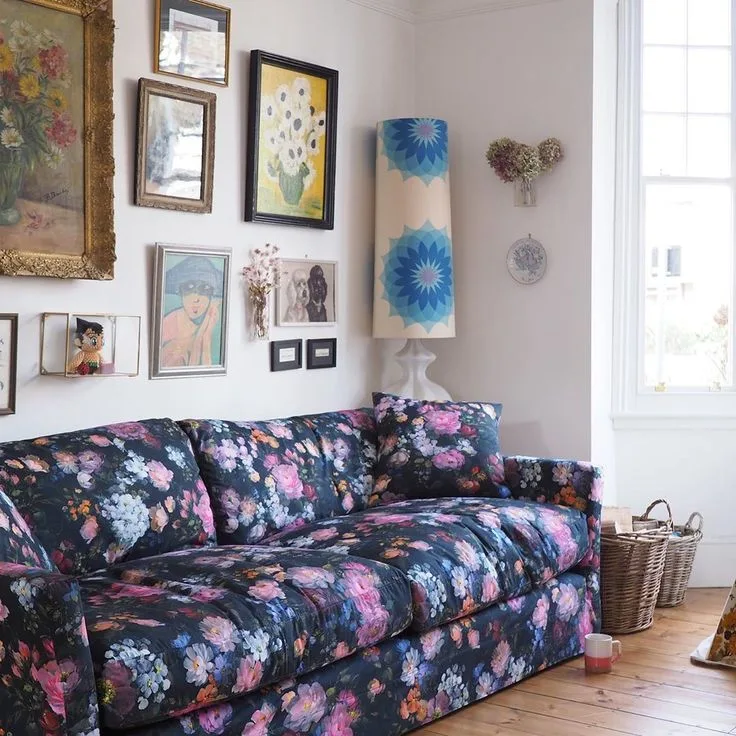
Begin with pictures you want to keep and look for an existing connection to the sofa: a patch of blue, a pale background, or a dark outline. Keep that connection visible. We wouldn’t match every frame here, because the differing edges are part of the appeal.
A black-and-white collection takes the opposite color approach. Above the charcoal sofa, pale picture backgrounds and dark outlines keep the wall connected to the seating. The print sizes aren’t identical. Their limited colors let them read as a group.
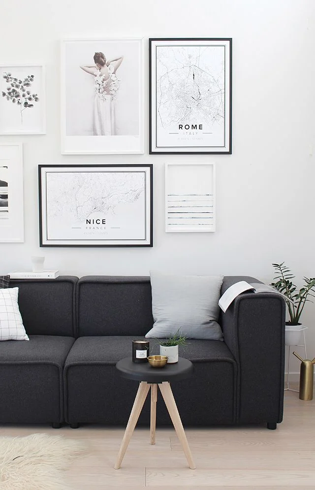
Choose this direction when the pictures have little color in common but their light and dark areas relate. Compare the whole collection with the cushions as well as the sofa. If your upholstery’s a strong color, compare the pale backgrounds and smaller accents in these green couch palettes.
Keep a Small Gallery Deliberately Compact
Color isn’t the only way to hold a collection together. The small group above this gray sofa leaves a broad area of pale wall around the frames. The wall isn’t full. Its open space gives the pictures a distinct boundary, so the group looks settled where it is.
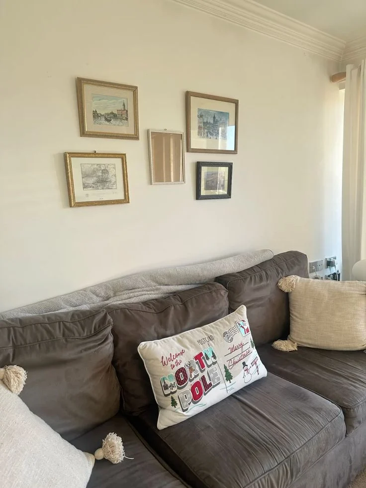
For a collection of small pictures, we’d keep their relationship to each other more noticeable than their relationship to the far edges of the wall. We wouldn’t spread them across the sofa’s entire width if that leaves each piece isolated. Bring the group together. Check the outline from the doorway.
The sofa doesn’t need a picture above every cushion. Leave the wall’s open area visible if the collection already has a clear shape. That restraint also works with the open furniture outlines and simple fabrics in these small living rooms.
Extend a Gallery into a Tall Wall Section
A tall arrangement puts that same attention to outline in a different direction. Here, mixed artwork rises above a pale sofa beside a window. The display follows the vertical area available to it, while the window keeps a clear boundary along one side.
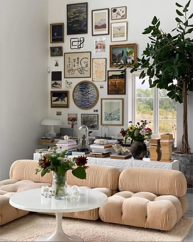
Borrow the direction when your collection has more room above the sofa than beside it. Include the window’s edge. The pictures don’t need identical outlines when the tall display’s outside contour gives their different shapes a shared place.
Keep nearby tabletop objects in view while judging the result. In this room, books and flowers add detail beneath the art, so the composition reaches beyond the frames alone. If your console is already full, try a more compact gallery before extending the collection upward.
Living Room Picture Ledges Give Frames a Shared Line
The galleries above rely on the arrangement of individual frames; picture ledges add a visible horizontal line beneath them. In this example, three slim ledges gather overlapping pictures beside a doorway. Their repeated pale color connects the rows, while the different frame heights keep the display from becoming a stack of identical bands.
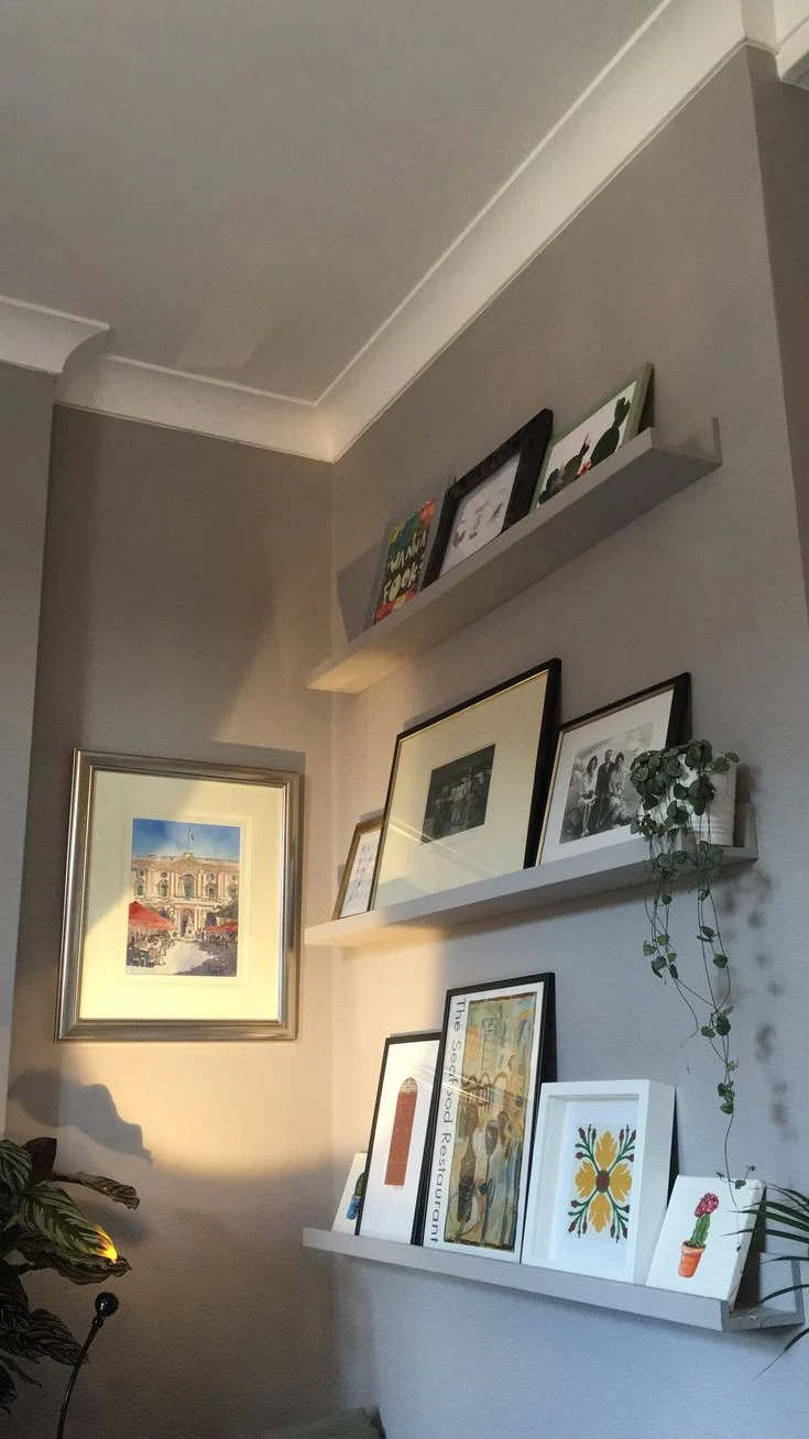
Use the ledge itself as part of the composition. Leave enough of its front edge visible to read as a continuous line, and keep the picture you care about from disappearing behind a taller neighbor. The layering should reveal the images as well as the frame edges.
An existing ledge can also make a small collection feel more connected to the wall around it. Don’t overlook the top edges. When every picture reaches the same height, the ledge’s horizontal line gets repeated across the top too; we’d try a taller frame beside a lower one for a less rigid outline.
Textile Wall Decor Gives a Plain Sofa a Textured Backdrop
For a wall that needs fewer separate outlines, a large textile offers a different focal point from rows of frames. The cream knotted hanging below has a broad top and a tapered lower edge above a cream sofa. Its diagonal strands and fringe supply the detail within an otherwise quiet color scheme.
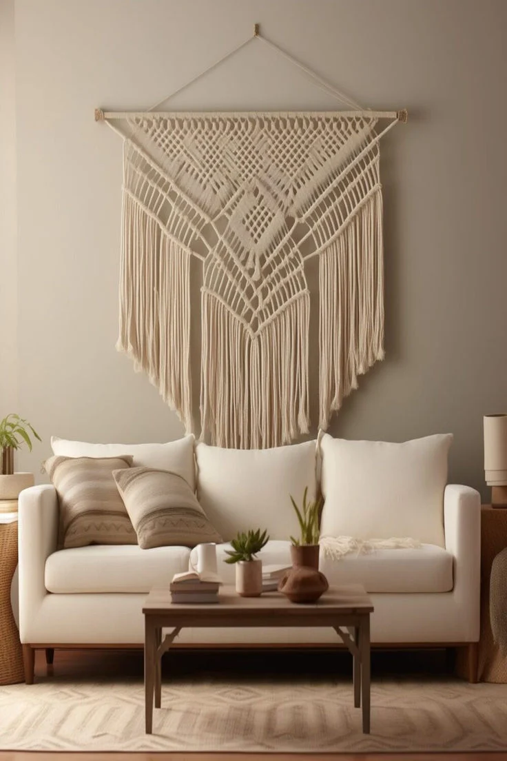
Notice how the tabletop has a firmer outline than the hanging. The hanging doesn’t bring another bright color. Its pattern and fringe provide the detail, so we’d look for a similarly visible edge when comparing a textile with a wall of nearly the same shade.
We’d compare the hanging with the sofa cushions before adding more texture around it. Deep fringe, patterned cushions and a strongly patterned rug can each ask for attention. The cream, gray-beige and taupe room examples offer more ways to distinguish nearby pale surfaces.
A Round Mirror Breaks Up the Lines Around a Corner Sofa
A textile introduces an irregular edge; a round mirror provides a simpler curved outline. In this room, the circular frame sits above a pale corner sofa, beside a rectangular window and a tall floor lamp. The curve is easy to pick out among those straighter shapes.
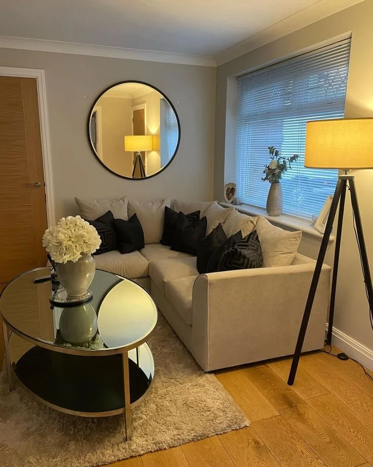
Consider the reflected view as part of the wall arrangement. Don’t judge the frame alone. A mirror brings whatever it reflects into the room’s display, so compare the view from the sofa with the view from the entrance before deciding where the circular shape belongs.
The lamp matters here too: its tall outline occupies the neighboring wall area, while the mirror stays over the seating. Before adding smaller pictures around a mirror, include nearby lamps and curtains in your view. The cozy living room examples explore how lamps, throws and repeated accents can finish the seating area around a focal point.
Combine a Mirror, Pictures and Shelves in One Wall Arrangement
A mirror can also share a wall with other objects when each group has a clear place. Below, a round mirror sits to the left, two framed pictures form a narrow column, and three white shelves occupy the right. The dark sofa remains the large block beneath the lighter wall display.
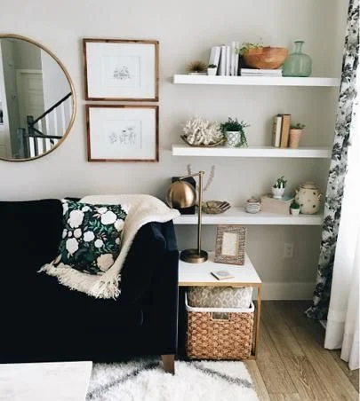
The separate groups are the useful idea to borrow. Shelves gather books and objects into horizontal bands, while the stacked pictures form a vertical link near the mirror. You can read the composition without treating every book, frame and ornament as a separate wall accent.
Keep the spaces between those groups visible. If the mirror, frames and shelf objects all crowd together, we’d simplify the shelf contents before introducing another wall piece. You don’t need objects in every gap. Exposed shelf and wall make the shapes you’ve chosen easier to distinguish.
Choose the Wall Display That Solves Your Room’s Gap
Pick the arrangement according to what the room already offers. Pictures with related colors can connect a patterned sofa to the wall; a compact group can give small frames a clear outline; a broad textile can add detail beside plain upholstery. A mirror needs a considered reflected view, and a mixed wall needs distinct groups.
Compare the wall from the seat and from across the room, with the neighboring lamp and window in view. Stop when the focal point feels connected to those existing pieces. For another room’s starting point, browse ZM Home and keep the wall display suited to the furniture you plan to keep.
For ideas that bring the whole room together, explore Living Room Decor Ideas for the Room You Already Have.